Two things go wrong with sign designs, and they go wrong at different moments.
The first happens at the machine. The middle of every letter O drops out and rolls off the mat, or the thin joins in a script font tear during weeding, or a beautifully detailed quote turns into a smudge because the strokes were too fine for the material. The second happens later, at a market stall, when a sign you were proud of sits on the table all day while a much simpler one next to it sells out.
Both problems trace back to the same decision: which quote file you started with. This is about making that decision well.
Tip
Short version: a quote design sells when it is specific enough that one person feels named by it, and it cuts cleanly when its construction supports every part you intend to keep, its strokes suit the material, and its paths are clean.
Why letters break when you cut them
Text is the hardest thing to cut well, and the reason is structural rather than artistic.
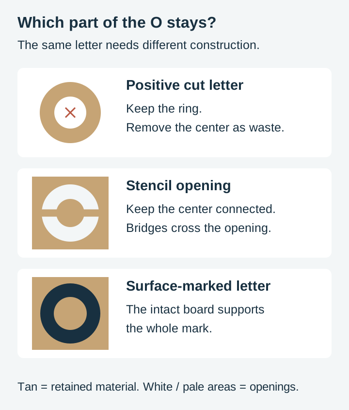
Look at a capital O. If you are cutting out the positive letter, the ring is the part you want and the center is waste. Removing that center is correct. If you are cutting an O-shaped opening in a stencil or panel, the center is a retained island: it needs bridges or a backing. A pocketed or engraved O keeps its center supported by the material beneath it. Plan workholding for any through-cut pieces, including waste.
Typographers call that inner shape a counter. Letters with counters are the usual suspects: A, B, D, O, P, Q, R, a, b, d, e, g, o, p, q, plus the numeral 0, 4, 6, 8 and 9. A word like "BOOKS" has four of them across five letters, because the B carries two.
Three ways designs solve it
Stencil fonts interrupt the letter opening with solid bridges so the center remains connected to the surrounding stencil. Army stencils are the obvious example. They read as deliberate and industrial, which suits some signs and fights others.
Bridges are strips of retained material added across an opening to connect an island to the surrounding panel. Done well they are nearly invisible at arm's length. Done badly they look like the letter has a chip out of it.
Backing supports separate retained pieces. Mount cut letters or decorative islands on a solid board, or engrave the lettering into an intact surface. The empty center of a positive O does not need a separate insert. Most wood signs take this route, which is why engraved signs tolerate far more delicate lettering than cut-through ones.
The design decision comes first, before you open your software. An engraving file may contain disconnected shapes that need support when cut through. A fine script may need larger sizing or thicker strokes for vinyl; settings alone cannot strengthen the finished geometry.
 Bathroom Humor Signs43 designs, commercial license included$3.99
Stroke width is the number that matters
The thinnest part of a letter decides whether a design works at a given size on a given material.
Scale a design down and the strokes scale with it. A script font whose hairlines look elegant at twelve inches becomes unweedable at four, because the connecting strokes are now narrower than the tip of your weeding tool. Nothing about the file changed. The relationship between the file and the physical world did.
Rules of thumb worth internalising, and they are about the material rather than the machine:
- Vinyl is the least forgiving, because a human has to remove the waste by hand. Very thin strokes lift with the waste or tear as you pull.
- Wood, engraved is the most forgiving. The laser is marking a surface, not separating one shape from another, although fine marks can still lose contrast or blur.
- Wood, cut through sits in the middle and depends heavily on the species and thickness. Thin strokes in plywood can splinter along the grain.
- Acrylic, cut through holds fine detail well but is brittle at narrow points.
If you want specific speed and power numbers, take them from your machine manufacturer's material chart and treat them as a starting point to dial in on scrap. We make design files rather than run production machines, so we will not hand you settings we cannot stand behind. Our laser engraving settings guide covers how to approach that testing sensibly.
Reading a quote file before you commit material to it
Open the file and look at it as a set of shapes rather than as words. Three checks take about a minute and save an afternoon.
Zoom to the tightest join. Find the narrowest point in the whole design, usually where a script letter connects to the next or where a serif meets a stem. Ask whether that width, at your finished size, is something your material and process can hold. If you are unsure, cut that one word on scrap before committing the board.
Check whether the text is one shape or many. Overlapping script letters usually need a union or weld to remove internal overlap cuts. Grouping or combining paths does not necessarily do that. Separate non-overlapping letters can remain separate paths; use your software’s layout controls to keep their spacing.
Look for stray nodes. Text converted from fonts by some tools carries far more points than the curve needs. Excess nodes rarely ruin a cut, but they can make a machine stutter on curves and they bloat the file. This is one of the things we clean up when we build a pack, because it is tedious and nobody should have to do it twice.
If layered designs are new to you, our guide to understanding SVG layers explains how multi-color sign designs are structured.
Now the harder part: which sayings actually sell
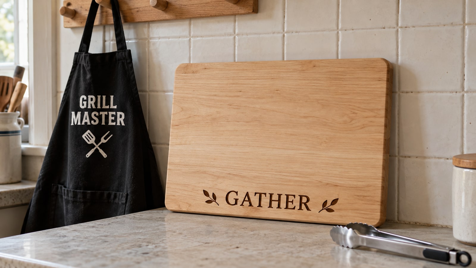
Craft fair tables are full of signs that say "Gather" and "Blessed" and "Live Laugh Love". They are competing with every other table, and with the discount aisle of every home store in the country. Generic sentiment is the most crowded space you can stand in.
What sells is specificity. A shopper stops when a sign feels like it was made about them, their room, their job, or the person they are shopping for.
Specific beats universal
Compare these two:
| Generic | Specific | Why the second works |
|---|---|---|
| "Bless This Home" | "Bless This Mess" | Names a real feeling instead of a sentiment |
| "Coffee" | "Don't Talk To Me Until This Cup Is Empty" | Someone recognises themselves |
| "Kitchen" | "Charcuterie Board Rules" | Names an actual thing the buyer owns |
| "Cats" | A cat's name in a cat-shaped monogram | Impossible to buy anywhere else |
The right-hand column is harder to write and much easier to sell. It also survives price comparison better, because a shopper cannot find the same words on a mass-produced sign.
Rooms are a shortcut to specificity
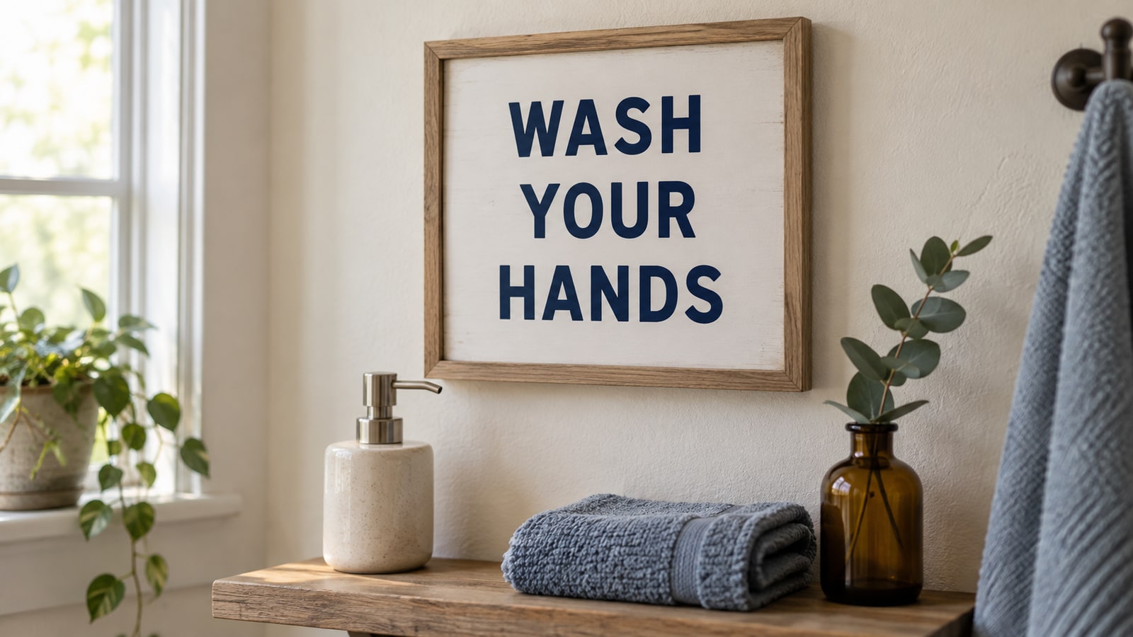
The easiest specific sign is one aimed at a room. Bathrooms in particular are a reliable seller, partly because they are small enough that people redecorate them on impulse, and partly because bathroom humor is a genre people will spend money on without agonising over it.
Kitchens work the same way. A charcuterie board with the serving rules engraved into it is a gift with an obvious recipient, which is exactly the sort of thing that moves at a fair.
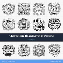 Charcuterie Board Sayings Designs34 designs, commercial license included$3.99
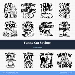 Funny Cat Sayings48 designs, commercial license included$3.99
Humor is high risk and high reward
Funny signs sell faster than earnest ones when the joke lands, and sit forever when it does not. The difference is usually whether the joke is about a shared situation or about the maker's own sense of humour.
"I Have Mixed Drinks About Feelings" works because a lot of people have had that week. An inside joke from your friend group does not, however funny it genuinely is.
A practical hedge: make one of each. If you are cutting a batch anyway, the marginal cost of a second design is small, and the market will tell you within one weekend which one to make ten more of.
Sizing so it reads from where the buyer stands
A sign is read at a distance, and a design that looks balanced on your screen at 200 percent zoom can be illegible from four feet away.
The practical test costs nothing. Print the design on plain paper at finished size, tape it on a wall, and walk backwards to roughly where someone would stand. If you cannot read it comfortably, the design needs bigger text, fewer words, or more contrast between the main line and the supporting lines.
Most quote designs have a hierarchy: one line carries the message and the rest support it. When everything is the same size, nothing is. When the key line is clearly dominant, the eye lands where you intended and the rest fills in.
Word count matters more than people expect. A four-word saying at a readable size fits comfortably on a small sign. A twelve-word saying at the same physical size means much smaller text, thinner strokes, and a design that has to be read up close. Long quotes want big boards.
Matching the saying to the material
Not every design suits every substrate, and the mismatch is usually about detail rather than taste.
| Material | Suits | Struggles with |
|---|---|---|
| Engraved hardwood | Fine scripts, detailed flourishes, long quotes | Low contrast, grain interference and very fine marks |
| Cut-through plywood | Bold sans-serif, short sayings | Thin strokes, small counters, long quotes |
| Vinyl on a painted board | Clean medium-weight fonts | Hairline scripts, tiny text, dense detail |
| Acrylic | Crisp geometric lettering | Very narrow connecting strokes |
| Slate | High-contrast bold text | Fine detail, which fills in and greys out |
Our guide to the best woods for laser cutting and engraving goes deeper on species choice if you are still settling on a default board.
Common mistakes worth avoiding
Buying a font-heavy design without checking the license. Fonts carry their own licensing, separate from the design file. When you buy a finished SVG the lettering is already converted to outlines, which is one of the quieter reasons to work from proper design packs rather than typing quotes yourself in a font you found free online. Our commercial license explainer covers what you can sell.
Scaling non-uniformly. Stretching a design to fit a board distorts the letterforms in a way that reads as cheap even to people who cannot say why. Resize proportionally and change the board instead.
Cutting the whole batch before testing one. The first of anything is a test piece. Treat it that way and the other nineteen come out right.
Pricing on material cost alone. Sign designs carry design value, not just plywood value, and pricing them at cost-plus leaves money on the table. Our post on pricing handmade crafts walks through the arithmetic properly.
Where to start if you are stocking a table
Pick three sayings for one room rather than one saying for three rooms. Buyers who stop at a bathroom sign will look at the other two bathroom signs. Buyers who stop at a bathroom sign and see a golf sign next to it just keep walking.
Cut one of each first. Look at them from across your workshop. Then commit the batch to whichever reads best from that distance, and bring the other two anyway, because the table has a habit of disagreeing with the workshop.
Our best selling craft fair items post has more on stocking decisions if a fair is what you are preparing for.
Every design pack we make ships as SVG, PNG, JPG, PDF, and EPS, with outlined lettering and prepared paths. Check whether the chosen artwork suits engraving, positive cut letters, or a bridged stencil before cutting. Browse the quotes and text collection and pick the room you want to own.