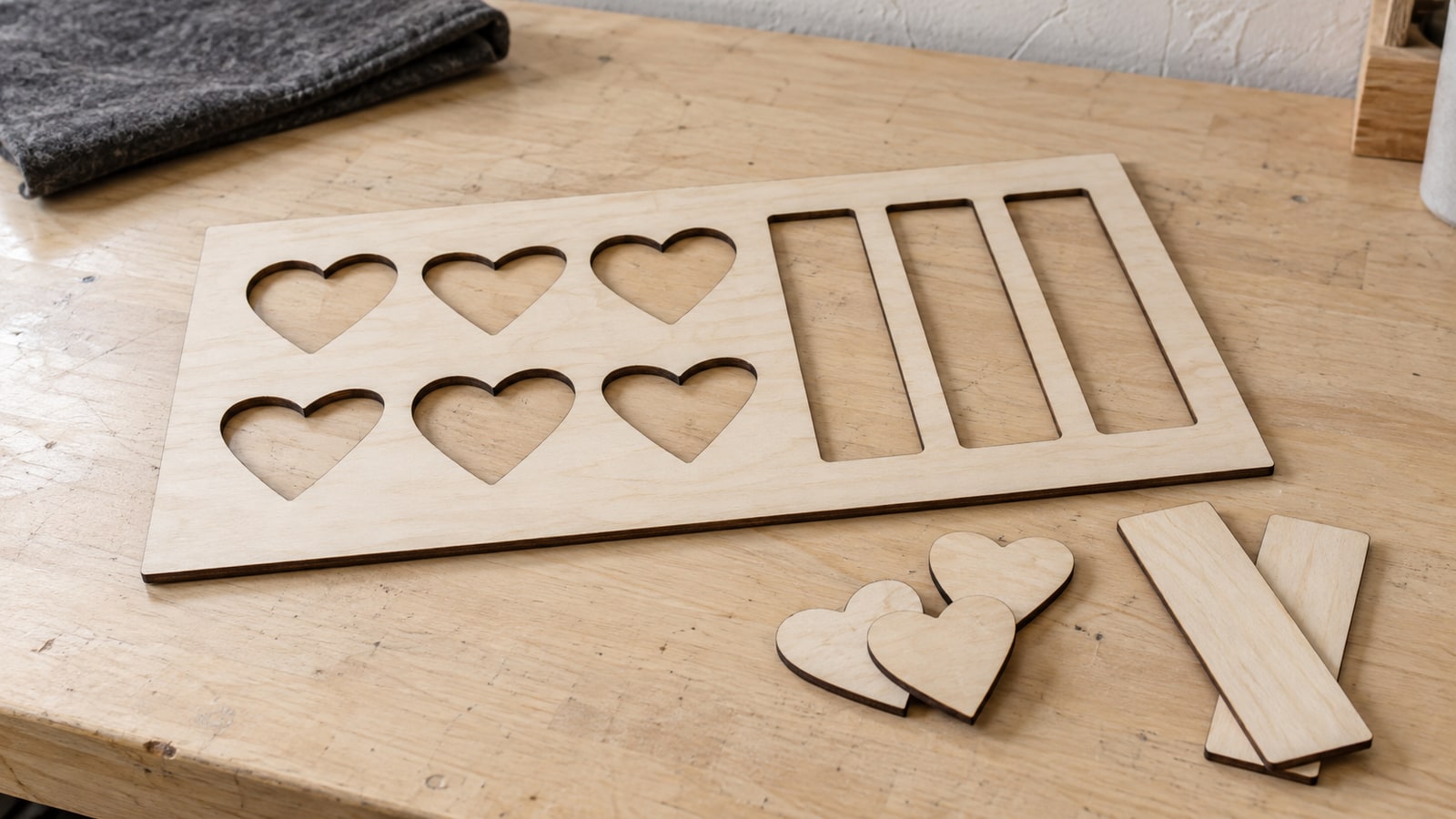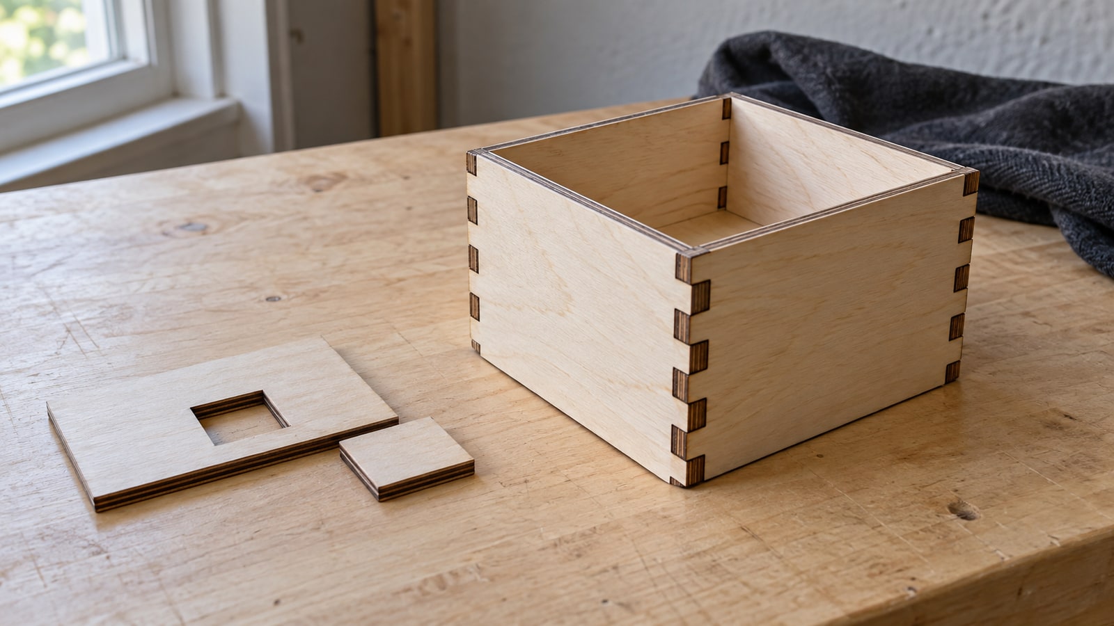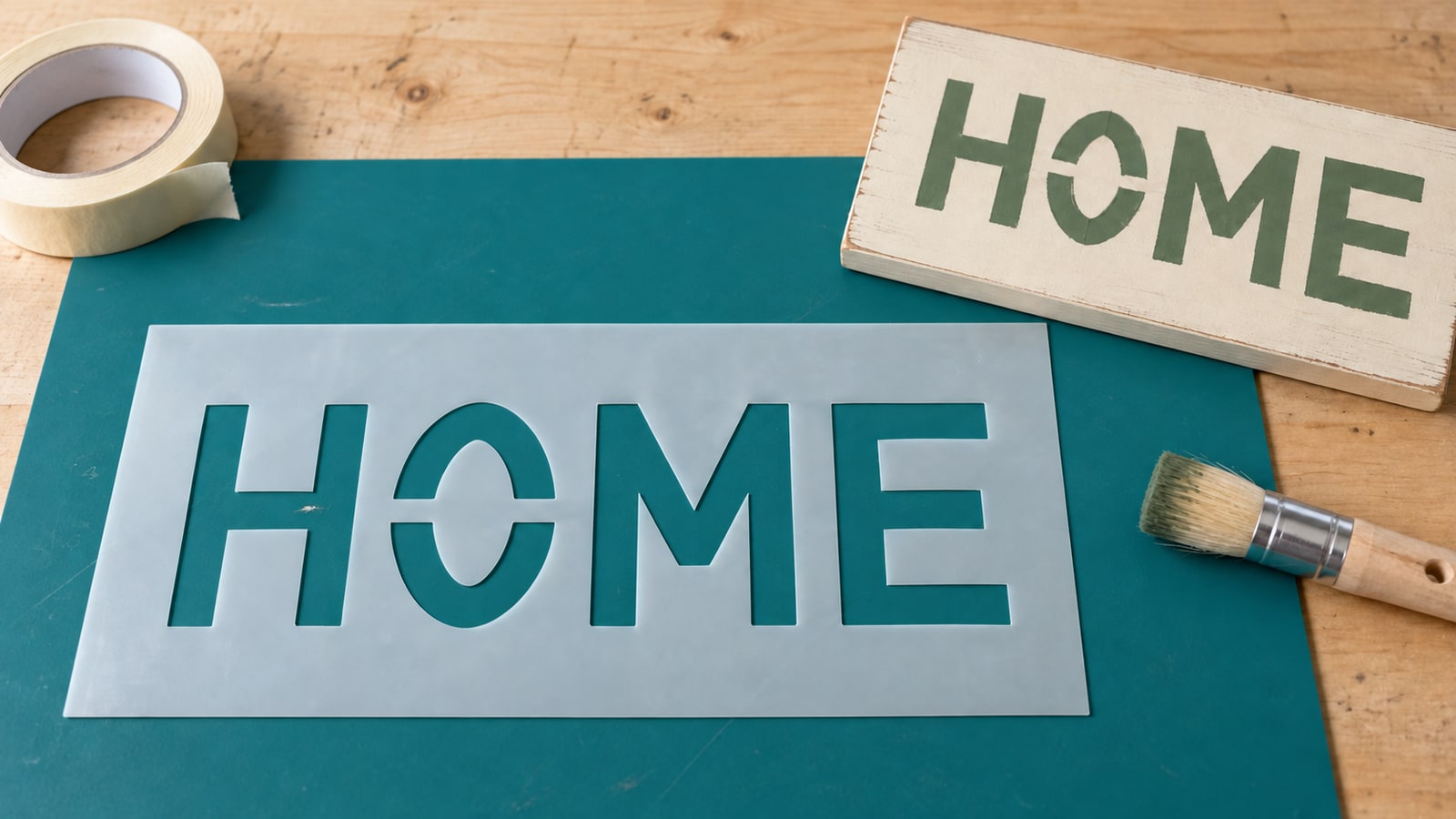
The cut finishes, you lift the sheet, and the middle of every O is lying on the machine bed. The A has lost its triangle. The word you spent an hour laying out now reads like a row of solid blobs, and the little counters you needed are scattered somewhere under the grate.
Nothing went wrong with the machine. The design simply asked for a shape that gravity was never going to allow, and no settings change fixes that. What fixes it is a bridge.
Tip
Short answer: any shape completely surrounded by cut line has nothing holding it, so it falls out. A bridge is a deliberate gap in the cut path that leaves a narrow strip of material joining that island to the surrounding sheet. Add one at the point where a break looks intentional, keep it wide enough to survive handling, and use the same width and logic on every letter in the piece.
Counters, islands, and the thing that falls out
Two words make the rest of this easy.
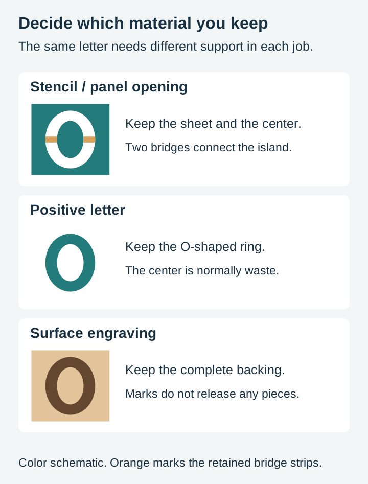
A counter is the enclosed space inside a letter. Look at a capital O, A, B, D, P, Q and R, plus a, b, d, e, g, o, p and q in lowercase, and the digits 0, 4, 6, 8 and 9. More than a third of the alphabet has one. A counter becomes a retained island when the surrounding letter area is removed from a stencil or panel. In a positive cut letter, the counter is usually waste.
An island is the same problem outside of lettering. The pupil in an animal's eye. The dot on an i. The inner ring of a Celtic knot. The centre of a spiral. The little shape trapped inside the loop of a scrolled monogram. Which pieces need support depends on what you keep. A detached dot on a positive letter is a loose piece; the same dot in a stencil is simply an opening.
The test is simple enough to do by eye. Set the whole design to one solid fill colour and look at it. First identify the material you will keep. Each disconnected retained piece needs a bridge, adhesive, backing or another deliberate support; waste pieces do not.
That test takes ten seconds and is worth doing before every stencil job, because the failure mode is silent. Nothing in your software warns you. The design previews perfectly, cuts perfectly, and then falls apart when you pick it up.
A split monogram is a nice illustration of the same geometry solved on purpose. The letter is broken across the middle to admit a name, and that break is not a compromise. It is the drawing. The surrounding frame or laurel gives the split halves somewhere to attach, but inspect the actual selected file before assuming it forms one connected cutout in your material.
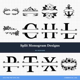 Split Monogram Designs50 designs, commercial license included$3.99
Bridges and tabs do two different jobs
These two words get used interchangeably and they should not be, because they solve opposite problems.
A bridge, also called a tie or a tie-bar, connects an island to the material around it so the island stays where you drew it. It is permanent. It is part of the finished piece, and you can see it in the result. Old military stencil lettering is the honest version of this: the breaks are so obviously deliberate that they became the look.
A tab, sometimes called a holding tab, holds a whole cut part inside the stock so the part does not move while the machine is still working. It is temporary. You remove it afterwards. An onion skin is a related but different method: a thin continuous layer left beneath the part.
CNC work needs suitable workholding, which may use tabs, an onion skin, adhesive, vacuum or another planned method. Most stencil work needs bridges and no tabs. A wooden name sign cut on a router often needs both: tabs to hold the panel steady, bridges to keep the counters in the letters.
Keeping the two words apart matters when you talk to your CAM software, because the tab settings in your toolpath will do nothing at all for a letter O. Tabs are usually configured in CAM toolpaths. Bridges are part of the retained artwork geometry, which is why they are our problem rather than yours.
Where a bridge should sit so it looks deliberate
Anyone can hack a gap into a letter. The difference between a stencil that reads as a design choice and one that reads as damage is entirely in placement, and there are only a handful of rules worth knowing.
Put it on the thick stroke, not the thin one. A bridge has to hold on at both ends. Landing it where the letterform is already at its narrowest gives it almost nothing to grip and creates the exact spot where the stencil will tear. On a serif face this means avoiding the hairlines. On a round letter it means the sides, where the stroke has weight, rather than the top of the curve.
Run it perpendicular to the edge it crosses. A bridge that meets the counter at a right angle looks like part of the drawing. One that crosses at a lazy diagonal looks like a slip of the knife. On a curved counter, aim at the centre of the curve.
Be symmetrical when the letter is. An O with one bridge looks broken. An O with two bridges opposite each other looks like a stencil. Same for a D, an 8 and a 0. Where the letterform has an obvious axis, put the breaks on it.
Use the same logic across the whole word. This is the one that separates good stencils from bad ones. If your O breaks at three and nine o'clock, your D and your Q should break in the same places, at the same width, at the same angle. A word where each letter was solved individually looks like a ransom note even when every individual letter is fine.
Count them properly. One bridge per counter is the minimum and is plenty on a small one. Two is better on anything large, because a big island held at one point pivots around that point and the stencil edge stops being crisp. On a very large counter, such as the middle of a 12 inch O for a wall stencil, three or four is not excessive.
Watch the letters that fight back. Lowercase e is the classic. Its counter is small, its aperture is nearly closed already, and a bridge across it eats most of the shape. Lowercase a and g have the same trouble at small sizes. When those letters stop being readable, the answer is usually a heavier lettering style rather than a cleverer bridge.
Do not forget the free-floating pieces. The dot on an i, an umlaut, a quotation mark and the two dots of a colon are all islands with no host stroke anywhere near them. Either connect them to the letter below with a visible stem, absorb them into the letterform, or accept that you will be placing them by hand.
One more thing that only shows up on connected lettering: in a good script, the strokes already cross each other constantly, and every crossing is effectively a bridge you did not have to draw. Script name signs hold together far better than block ones for exactly this reason. The trap is the opposite one, where the loops in a script are so small that they clog with paint or close up in the cut. Our guide to how much SVG detail survives at small sizes covers where that line sits.
How wide a bridge has to be
The width you can get away with depends on what the material has to survive, not on what the machine can produce. Thin bridges can be cut but still fail during peeling or repeated use. Check machine/material compatibility and the actual retained width.
These are design-side starting points drawn from how we build files rather than measurements we took, so treat them as a place to begin and adjust from a test piece in your own material.
| Material / process | Check before choosing bridge width |
|---|---|
| Reusable stencil film | Flexing, peeling and repeated repositioning |
| Adhesive vinyl stencil | Transfer, adhesive grip and surface texture |
| Plywood stencil or panel | Grain, ply quality, kerf and handling |
| Acrylic stencil | Brittleness and stress at inside corners |
| Routed panel | Cutter clearance, offsets and workholding |
Two further checks matter.
Kerf eats into the figure. A bridge is the material left between two cut lines, so if your software cuts straight down the drawn path, each of those cuts takes half its kerf out of either side of your bridge. A 2 mm bridge drawn for a laser with a 0.2 mm kerf finishes at about 1.8 mm. Whether that is strong enough depends on the material. With a router, account for the actual cutter diameter and toolpath offsets.
Thickness, bridge length, grain direction, stock quality and corners all affect strength. Paint stencils also need good surface contact and controlled paint loading; changing bridge width alone does not solve bleed.
Paint stencil, vinyl cutout, wood cutout: same geometry, three answers
This is where most of the confusion lives. The counter in a letter O is identical in all three jobs. What is holding it is completely different, and so is the amount of bridging you actually need.
The paint stencil
You are keeping the sheet and throwing away the letters. Every counter has to stay in place while paint goes over it, then survive being lifted and often used again.
If the stencil is reusable, cut from mylar, acrylic or thin ply, bridges are mandatory. There is nothing else in the system. Every island is either bridged or lost.
If it is a single-use vinyl stencil, you get one free pass. Transfer tape carries the counters along with the background, so in principle you can transfer a bridgeless stencil and every island lands in register. In practice the small ones lift with the tape, shift when you burnish, or drift a millimetre and leave a lopsided letter. On short words in large text you will often get away with it. Long sayings and rough coir can be harder to transfer. Test the actual adhesive and surface before deciding whether bridges improve the job.
The other thing to plan for in a paint stencil is bleed. Paint wicks under any edge, and it wicks worst at a thin bridge where the sheet is least supported. Wider bridges do not just resist tearing, they hold the film flat.
Doormats and painted signs are the projects where all of this bites first, because the surface is textured and the words are long.
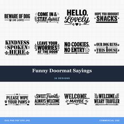 Funny Doormat Sayings30 designs, commercial license included$3.99
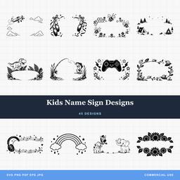 Kids Name Sign Designs45 designs, commercial license included$3.99
The vinyl cutout
Here the letters are the product and the counters are waste. That flips the whole problem.
The liner normally holds the positive letters while you weed away counters; transfer tape then carries the retained pieces. Separate small details can work, but still need suitable film, cut quality and adhesion.
Two exceptions are worth knowing. First, if you want the counters to show as the material colour underneath, which is normal, then you are fine. If instead you wanted the counter filled in, the design needed to be drawn differently rather than bridged. Second, layered designs where one colour sits inside another have their own alignment problem rather than a falling-out problem, and our post on multi-layer SVG files covers how those are built.
The weeding itself is the real constraint on small vinyl letters, since a counter you cannot get a pick into might as well be solid.
The wood or acrylic cutout
Two separate failures here, and they need different fixes.
If you are cutting letters out of a panel, so the finished sign is a board with letter shaped voids in it, every counter is an island in that board. This is geometrically the same as a stencil and needs the same bridges. A name sign cut this way with no bridges gives you a board with a row of solid ovals and a small pile of loose middles.
If you are cutting letters as separate pieces to glue onto a backer, the counters are just scrap and can fall wherever they like. Plan workholding so the letters do not shift, tip or get knocked before the job finishes; tabs are one option. On a laser this matters most for thin material that can lift into the beam. On a router it is a safety issue rather than a quality one.
Routed work adds a third constraint the other processes do not have. A bit cannot cut a slot narrower than its own diameter, so a counter narrower than the bit simply will not open, and an interior corner can never be sharper than the bit radius. On a 1/8 inch bit that is a 1.6 mm minimum corner radius on every inside corner in every letter. Small text on a router is a different craft to small text on a laser, and our CNC router SVG guide goes into how that changes design choices.
| Paint stencil | Vinyl decal | Wood panel cutout | |
|---|---|---|---|
| What you keep | The sheet | The letters | The panel |
| Counters are | Islands to hold | Waste to weed | Islands to hold |
| Bridges needed | Yes, or transfer tape on single use | Rarely | Yes |
| Workholding needed | Hold the sheet during cutting | Liner and mat/feed support | Plan support for the panel and any loose parts |
| First thing that fails | Paint bleed under thin bridges | Weeding tiny counters | Counters dropping through |
Adding bridges to a design yourself
The method is the same in every real vector editor, because it is one boolean operation repeated. Inkscape names below, but Illustrator, Affinity Designer and NodeCraft on our sister site Craftgineer all do the same thing with different menu labels. NodeCraft is a browser vector editor with proper node and path editing, free to use and export with a free account, though saving a project needs a paid plan starting at $4.99 a month.
-
Convert live text to paths. In Inkscape that is Path then Object to Path. Until you do this you are editing a font, not a shape, and nothing you cut into it will stick.
-
Decide your bridge width and draw one rectangle at that width. Make it long enough to cross the stroke completely, from inside the counter to outside the letter. One rectangle, drawn once, then duplicated, is how you get consistent widths across the whole word.
-
Position and rotate it. Place it perpendicular to the edge it crosses, on the thick part of the stroke. Duplicate and mirror for the opposite side of a symmetrical letter.
-
Subtract from the cutout area. This assumes the filled letter represents material to remove from the stencil. Select the letter and the rectangle, then Path then Difference. The rectangle is removed from the letter shape, which leaves a strip of material exactly where it was, joining the counter to the outside world. That strip is your bridge.
-
Repeat for every island in the design. Duplicate the same rectangle rather than drawing new ones, and your widths stay identical without you thinking about it.
-
Check the result at cut size. Zoom to the actual finished dimension and look at the narrowest point of each bridge. This is where a bridge that looked fine at screen size turns out to be half a millimetre.
-
Tidy the paths. After a lot of boolean work a file can end up with duplicate nodes and stray fragments left behind by the subtractions. Inspect the result and remove unintended fragments. Union merges overlapping filled areas; it is not a universal cleanup command.
Cricut Design Space can do the same thing with Slice, with two caveats. Slice works on exactly two shapes at a time and consumes both of them, so duplicate everything before you start, and it does not group well, so plan on doing letters one at a time. For a whole word it is genuinely faster to bridge the design in a vector editor and import it finished.
When a bridge is the wrong answer
Not every falling-out problem is a bridging problem, and reaching for the boolean tool first sometimes makes a design worse than it needed to be.
Engrave it instead of cutting it. Counters and islands are only a problem when the line goes all the way through. Engraved or scored, a design can have as many floating shapes as it likes, because nothing is being separated from anything. On a wooden sign this is very often the better looking result anyway.
Reverse the piece. Cut the letters as positives and glue them onto a backer board rather than cutting voids into a panel. The counters become scrap, the bridging problem disappears, and you get a raised sign instead of a flat one.
Change the lettering. A heavy slab or a proper stencil style has the breaks designed into the alphabet, drawn by someone who thought about every letter rather than solved one in a hurry. That is a better result than bridging a delicate face that never wanted holes cut in it.
Pick a design drawn for the job. This is the honest recommendation, and it is where we can actually speak from experience, because drawing the files is what we do. A design intended to be cut has its connections planned as part of the composition: the frame that catches the loose ends, the baseline bar that ties a row of letters together, the deliberate break in a monogram. It does not have them chopped in afterwards, and the difference is visible from across a room.
Files that hold together
Every pack on PrintCutCarve is $3.99 and ships as SVG, PNG, JPG, PDF and EPS, with a commercial license included in the price. You can sell as many physical pieces as you like from it, print-on-demand production is permitted too, and the only restriction is that the digital file itself may not be resold or passed on.
If your next project is a stencil or a cutout sign, start with designs where the connections are already part of the drawing. Split monograms are built around a deliberate break with a frame to hold it, name signs are drawn to sit on a baseline, and the wider quotes and text collection is where the lettering packs live. The three packs below are the ones to open first.
Designs for this project
Frequently Asked Questions
Why did the middle of my letter O fall out?
If you are keeping a stencil sheet or a panel with letter-shaped openings, the O center must remain supported. A bridge connects it to the surrounding sheet. If you are keeping a positive O-shaped letter instead, its center is normally waste and falling out is expected.
How wide should a stencil bridge be?
Wide enough to survive being handled in your material, which is the real constraint rather than the machine. There is no universal width across films, plywood and routed stock. Test the finished bridge after allowing for kerf or cutter offset, and keep enough strength for repeated handling.
Do vinyl letters need bridges?
Usually not. If the letters themselves are the decal, the liner normally holds the letters while you weed, then transfer tape moves them onto the surface, so nothing is left floating. Single-use adhesive stencils can also retain separate counters with their adhesive after transfer; reusable unsupported stencil sheets need connections.
Can I remove the bridges from a design that has them?
Yes, but a bridge may be modeled as retained material between closed cutout regions, not as an open path. Restore the intended continuous letter area with suitable Boolean edits, or return to an unbridged source. Check how any resulting islands will be supported.