You bought an alphabet pack to make a name sign. Then you opened it, dropped seven letters onto the canvas, and spent the next half hour nudging them sideways because the spacing looked wrong at every size. The O has a mysterious extra piece in the middle. One letter is visibly heavier than the rest. And somewhere in the download folder there is a .ttf file you were not expecting.
Lettering is the part of cut-file work where the file craft shows up fastest. A landscape scene can be a bit sloppy and still look fine. A row of letters cannot, because human eyes are trained on letterforms from childhood and spot an uneven one instantly.
Tip
What to check before you buy: whether you are getting drawn paths or an installable font, whether the counters are real holes rather than shapes stacked on top, whether the letters share a baseline and a weight, and whether the thinnest stroke survives at the size you actually make things. Those four answers decide almost everything about how the pack behaves.
Paths or a font? The answer changes both the workflow and the license
This is the first fork in the road, and plenty of listings are vague about which side of it they sit on.
A font is a piece of software. You install it, and after that any program on that computer can set text with it. Live text typically stores characters and font references; some formats can embed fonts, and converting text to paths stores the outlines. Move that file to a laptop without the font and the letters silently become something else.
An alphabet SVG is artwork. Each letter is already drawn as a fixed path with a specific shape, and that shape travels inside the file. Nothing to install, and no substitution when the file lands in LightBurn instead of Design Space.
| Installed font | Alphabet SVG | |
|---|---|---|
| Setting a long sentence | Fast, just type | Slow, you place each letter |
| Spacing between letters | Handled by the font's own metrics | Yours to set, or drawn into the design |
| Behaves the same on another computer | If the font is available, embedded or outlined | Path geometry travels with the file; check importer support |
| Decorative detail inside the letters | Rare, and usually flattened | Normal, and the whole point |
| Licensing | Separate end user agreement, per font | Covered by the design pack's license |
Neither is better. They answer different questions. If you are cutting paragraphs of text, an installed font is obviously the right tool. If you are making a single ornate initial for a nursery wall, a font will not give you the letter you actually want, because that letter is an illustration.
The licensing part people skip
A font license and a cut-file license are not the same document and they do not cover the same things.
A font comes with its own end user agreement written by whoever made the font. Free fonts may be open-licensed or restricted to personal use, and a fair number of paid ones distinguish between using the font in your own work and using it on merchandise you sell. Some ask for a separate extended license for commercial products. You cannot know which without reading the terms for that specific font, and "I converted it to outlines" does not change what the agreement says.
A design pack license covers the artwork. Ours comes with every purchase at $3.99, allows unlimited physical products including print-on-demand, and stops at one line: you cannot resell or redistribute the digital file itself. Our commercial license guide has the full text in plain English.
The trap is a pack that ships both. If your download contains SVGs plus an .otf or .ttf, you are holding two products under two agreements, and the pack's cheerful "commercial use included" line may only apply to one of them. Ask the seller which, in writing, before you build a product line on it.
Counters: real holes, or lids sitting on top
Open a capital O in an alphabet pack and look at the middle. There are two completely different ways that shape can be built, and they look identical until the moment you cut.
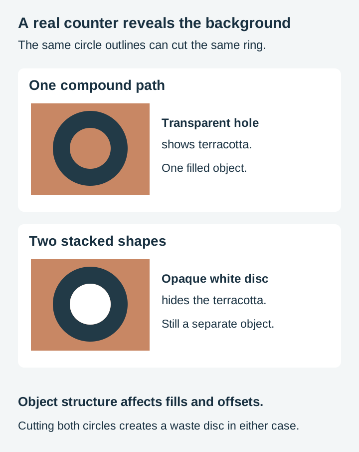
A true compound path has the counter drawn as a hole inside the same path as the letter. The letter is one object. The hole is genuinely empty, so whatever is behind it shows through.
A stacked shape is a white disc drawn on top of a solid black O. On a white screen the result looks the same. It is not the same. Cutting both circle contours can produce the same ring and waste disc as cutting a true compound O. The difference matters for fills, offsets, object handling and operation assignment, not because a real hole avoids creating waste. And if you place the letter on a coloured board in your software, the fake counter reveals itself as a white blob.
Place the letter over a coloured rectangle and see whether that background shows through the counter. You can also inspect the objects or change their fills individually. A white overlay stays opaque until you remove it or turn it into a real hole.
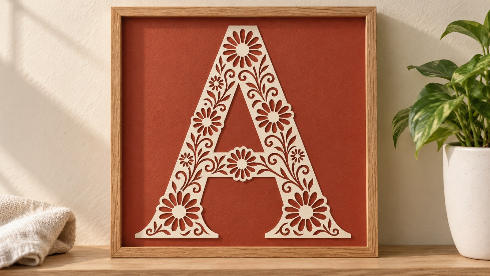
This matters most on decorative alphabets, because they are full of interior detail. The floral alphabet uses decorative compound geometry: the outer silhouette, the counters, and the petal and stem openings inside the letter body. The background shows through those openings in the digital layout. Making the physical papercut still requires cutting and mounting its retained pieces.
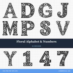 Floral Alphabet & Numbers36 designs, commercial license included$3.99
Worth knowing before you commit material: an interior full of holes is drawn for engraving, for vinyl on a contrasting surface, or for a papercut style with a backing layer. Cut clean through and some of those little interior shapes have nothing holding them, depending on how each flower and its center are connected. That is not a flaw in the file, it is the difference between a design meant to be marked and a design meant to be pierced. Our post on stencil bridges and tabs covers how to add the connections if you want to cut a design like that through.
Connected script versus separated letters
Script alphabets come in two flavours and buying the wrong one costs you an evening.
Separated letters are each drawn as an independent shape with no attempt to join the next one. Perfect for initials, standing letters, and any layout where you want to control the spacing. Fine for name signs too, as long as you accept that you are doing the arranging.
Connected script is drawn so the exit stroke of one letter meets the entry stroke of the next. Set a word and it reads as continuous handwriting. This only works if the alphabet was designed that way from the start, with the joins at a consistent height and angle, and with entry and exit strokes on every letter that needs them.
What goes wrong is trying to fake the second from the first. You overlap the letters until the strokes touch, and now you have a stack of separate closed shapes with cut lines running straight through every overlap. On a laser that is a visible scar across the join. On a cutting machine it is a piece that falls apart. The fix is to weld or union the letters into one outline before cutting, which every major program can do, but you have to remember every time.
A connected alphabet also needs the joins to land at the same height. If the exit of the a sits slightly higher than the entry of the n, every word you set has a small kink in it. You will not be able to say what is wrong, only that it looks off.
Kerning, or whether the letters were drawn to sit together
Kerning is the spacing between specific pairs of letters, and it is the single most common reason a set of technically clean letters still looks amateur when you spell something with it.
Letters are not boxes. An uppercase A slopes away at the top, a V slopes away at the bottom, and a T has a great deal of air underneath its crossbar. Set A and V side by side with equal gaps and the pair looks like it has fallen apart, because the visual space between them is much bigger than the measured space. A well drawn pack accounts for that. A pack assembled letter by letter with no thought for pairs does not, and you end up eyeballing every join.
Three other things belong in the same check:
A shared baseline. Every letter should sit on the same invisible line, with the round letters like O and S extending a hair below it. Rounds sitting exactly on the baseline look like they are floating, which is why type designers overshoot them deliberately.
A consistent cap height. Capitals should follow a consistent optical height, allowing intentional overshoot and decoration. A pack where one letter is a few percent taller reads as a typo.
A consistent weight. The stems should be the same thickness across the whole set. This is the giveaway on alphabets that were traced from mixed sources: the M looks heavy next to the I, and no amount of resizing fixes it because the proportions are baked into the shapes.
Arrange the supplied alphabet artwork in a row at one consistent letter height, stand back from the screen, and look for the letter your eye keeps returning to. That letter is the problem.
Stroke weight and what your material will actually hold
The thinnest part of a letter decides whether the design works at the size you make things. Everything else is style.
Scale a design down and the thin parts scale with it. An elegant hairline that behaves beautifully on a twelve inch sign is not the same object at three inches on a keychain, even though nothing about the file changed. What changed is the relationship between the file and the physical world.
The notes below are design-side starting points that come from how we build lettering files, not measurements taken on a machine. Your material, your bit, and your settings all move the line, so cut one test piece before committing a board.
| Process | What supports the detail | What to inspect |
|---|---|---|
| Engraving on wood or slate | The intact blank | Closely spaced marks may merge |
| Cutting through acrylic | The connected retained shape | Narrow points can become brittle and snap |
| Cutting through plywood | Connected wood and veneer layers | Thin strokes may splinter or break |
| Vinyl decal | Liner, transfer film, then the final surface | Thin joins can tear or lift during weeding |
| CNC routing | Tool access plus material strength | A tool cannot enter a gap narrower than its cutting diameter |
That last row is worth sitting with, because it is geometry rather than technique. A router cannot machine a slot narrower than the tool making it. A retained external connecting stroke can be narrower than the bit if the tool has access on both sides. Its strength is a separate question; an internal cut channel narrower than the bit cannot be machined that way. Check the narrowest point of a lettering design against your bit before you buy the pack, not after.
For small pieces specifically, our guide to how much SVG detail survives at size goes further into where the limits sit.
Decorative alphabets are a different product entirely
Once a letter carries illustration inside it, you are not really buying type any more. You are buying twenty six pieces of artwork that happen to be letter shaped, and they are used differently.
The clearest sign is that decorative alphabets are for one letter at a time. A single ornate initial on a nursery wall, a monogram on a cutting board, a letter per stocking. Spell a whole word in an elaborate decorative face and it turns into visual noise, because each letter is competing with its neighbours for attention.
The three we make each solve a different job.
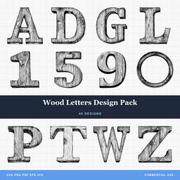 Wood Letters Design Pack40 designs, commercial license included$3.99Floral Alphabet & Numbers36 designs, commercial license included$3.99
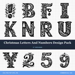 Christmas Letters And Numbers Design Pack37 designs, commercial license included$3.99
Wood Letters are a dimensional slab serif with hand drawn grain hatching running through every face. All the interior linework means these are drawn to be engraved rather than cut through, and they look best marked into a light hardwood where the fake grain plays against the real grain. The pack runs the full A to Z plus numerals and a round frame element.
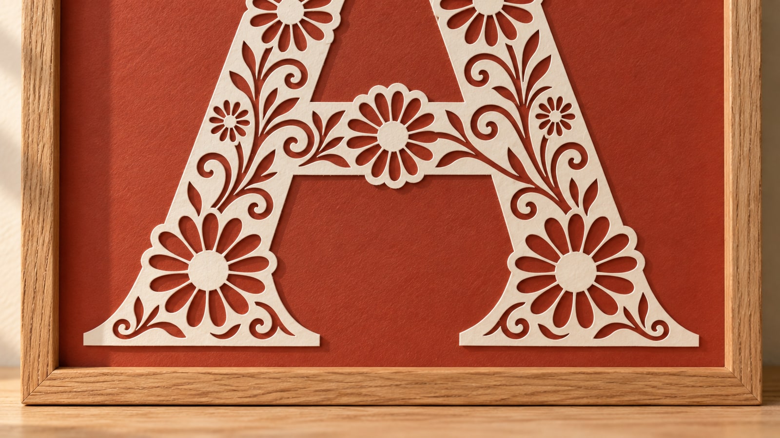
Floral Alphabet is the papercut style: a solid letter body pierced with daisies and vines. Complete A to Z with 0 to 9. Good as a large single initial, on a card, or in vinyl over a contrasting board.
Christmas Letters and Numbers is seasonal ornament work. Letters dressed with holly, santa hats, pine, and baubles, plus most of the numerals and an exclamation mark for year plaques and door hangers. Because each letter carries different decoration, these look best used singly on ornaments rather than strung into a word.
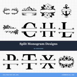
For monograms specifically, a split frame is a neater answer than a decorative letter, because the frame is reusable and the letter drops into the gap. Those live in our split monogram pack, and the personalization guide covers the conventional letter order for a married three letter monogram, which is a real source of complaints when it goes wrong.
Coverage: what is actually in the pack
The listing photo shows a beautiful A. That tells you very little about what arrives.
Run through this list before you buy, because the gap you discover later is always the one you needed:
- Uppercase and lowercase. Many decorative alphabets are capitals only. If you need a lowercase e for a family name, check.
- Numerals. Est. dates, house numbers, birth years, and sports jerseys all need them, and plenty of alphabet packs stop at Z.
- Punctuation. An ampersand for "Smith & Sons", an apostrophe for "Grandma's Kitchen", a period, a hyphen for double barrelled surnames.
- Accented characters. José, Chloé, Zoë, and Renée are ordinary names, and almost no decorative alphabet includes the accents. You can usually draw one, but budget the time.
- Alternate letters. Some packs include two or three versions of the common letters so a double L in a name does not look copy pasted.
- File formats. Ours ship as SVG, PNG, JPG, PDF, and EPS, so the same letter goes to a cutter, a sublimation printer, or a print shop without a conversion step.
Missing lowercase is the most common gap, missing accents the most annoying.
The five minute check after you download
Before you cut anything, open the pack and do this. It is faster than remaking a board.
- Set a coloured background behind a letter with a counter. Real holes let the colour through. Stacked shapes show up as white.
- Arrange the supplied alphabet artwork at one size in a row and look for the letter that draws your eye. Uneven weight and inconsistent height both surface immediately.
- Spell the longest word you plan to sell. Not the alphabet, an actual name. That is where spacing problems live.
- Zoom to the narrowest point in the design, then compare it against your material and your bit at finished size.
- Cut one letter on scrap. Ideally an O or an R, since they contain the counters, the curves, and the joins that everything else is made of.
If a letter needs its spacing tuned or a stroke thickened, that is normal design work rather than a defect. What you are checking for is whether the pack gives you a good starting point or a project.
If you want a quick monogram without opening design software at all, Craftgineer's monogram generator will produce a cutting ready SVG in a few seconds. Craftgineer is our sister site, and the monogram tool is free, though like all their tools it needs a free account first.
Pick the alphabet for the job, not for the sample image
Standing letters and engraved name plaques want a drawn alphabet with weight and interior interest. Long quotes want a font and a weld. Single initials want the most decorative letter you can find, because that letter is carrying the whole piece.
Every lettering pack we make ships as drawn paths with the counters built as real holes, the letters aligned to a shared baseline, and the node counts cleaned up so nothing stutters on a curve. Each one is $3.99 with the commercial license included, or the whole catalog comes with the Platinum Club at $59.99 a year.
Browse the quotes and text collection and start with the alphabet that matches the object rather than the one that looks best on a screen.
Designs for this project
Frequently Asked Questions
Is an alphabet SVG the same as a font?
No. A font is software you install, and live text may need that font or a permitted embedded copy to render correctly. An alphabet SVG is artwork: each letter is already drawn as a fixed path, so it opens the same way everywhere and needs no installation. They also carry different licenses, since a font comes with its own end user agreement that is separate from any design license.
Why does the middle of my letter show up as a second piece?
Because the counter was built as a separate shape stacked on top of the letter instead of as a hole in it. On screen a white disc on a black O looks identical to a real hole. A cutting machine can see two separate contours; whether that changes the result depends on the assigned operations. Change the fill colour or drag the letter over a coloured background and a fake counter turns into a visible white blob.
Should I buy a connected script alphabet or separated letters?
Connected script if you are setting whole words and want them to read as one flowing piece, because the entry and exit strokes are drawn to meet. Separated letters if you are making single initials, standing letters, or name signs where you want to control the spacing yourself. Setting a word from letters that were never drawn to join is the slowest of the three jobs.
Can I sell items made from an alphabet pack?
From a PrintCutCarve pack, yes. The commercial license comes with every purchase and covers unlimited physical products, including print-on-demand. What you cannot do is resell the digital files. If your lettering came from an installed font instead, that font has its own separate license and you need to read its terms.